Tuesday, September 06, 2005
Candy: A PDF Of A Magazine/This Way Up: A Wall Of A Magazine
 Candy: There's no doubt that technology has hugely impacted upon the media world. Before anyone says anything, this isn't going to be one of those rants on the mangling effect of a biased corporate media on current affairs (- there i got it in anyway, says he). The PDF has long been industry standard for shipping documents intent for physical reproduction back and forth across the electronic frontier.
 Off the inter-web highway and back to the terrestrial domain, stark black and white photocopies have equally been the fuck-the-industry-standard for zines of all shapes, sizes and ilks. Back in the day, one way of judging the health of a music scene, was through gauging the producer/consumer ratio through counting the number of fan-zines knocking about. This all changed when the net and the use of bulliten boards on line created a ready made form of distribution and a forum for obsession. Over at Backlash there has been a marriage of these new technologies in the production of Richard Seabrooke’s Candy - a magazine designed like one heading for the printers but distributed directly into your email address. An online zine, for you to print off DIY desktop stylee. The advantages of this are obvious.
While on web forums you have to wade through endless amounts of clique based in-jokes, other people with crap humour and the tiresome guilt of just lurking and not contributing,. Then there's the pain of static pages which never change. By the time they do, you've lost interest. Candy is the best of the web, with the option of printing it off on your desktop for viewing straddled across the toilet. Cost-free the designers can wank off to their hearts content with full colour exposure of their ideas, and no requirement to chase ads. If the thing gets a readership base, and there's a rumour 2,000 people already subsribe, it has a ready made format to chase up the ads with.
Aside all that is the magazine worth your "right click save as"? There's been two so far. With the first topping the second in quality. With roots somewhere within the regular nights organised by Backlash in Wax (I'm guessing kids, they give the mag it's webspace....) it betrays something about self-perception within that particular zeitgeist. Unfortunately, without being a cruel auld wench, like Mongrel I’m divided -design and the means of production are the best thing this magazine has going for it - no doubt. As with content, it gives some insight into what you can expect Totally Dublin to be covering three months down the line.
It lazily tries to come to grips with street art by harpering on about Asbestos and by cuting and pasting the front of his webpage in to the mag. It does have some really beautiful spreads on graphic design. Something to relish when its coming for free and without any of the industry jargon you get in mags like Computer Arts. Musically its focus is more Electric Picnic and Sonar than Witness or whatever the hell the kids are calling it now. I have to hold back: this magazines is the work of one bloke, and while it totally apes the trend of publications like Mongrel. It is beautifully designed, and as a testament to the interests and loves of one head, then it gets a props from me. The next issue hits the Backlash site mid September.
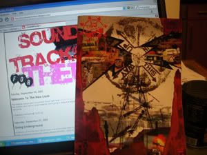
 This Way Up: Another crowd who are doing themselves no favours with a shoddy web presence but really can be said to have their finger firmly stuck on the pulse of Dublin are This Way Up! Coming from somewhere out of the Blackfortmileu (who recently put on Planet Mu's excellent Chevron to a moribund Eamon Doran crowd) they take the aesthetic of street art and apply it to a comic strip. I fell in love with this from the off - their logo is a stencilled series of arrows around a circle, which can be seen graffitied in the Liberties. The second cover was perhaps the best representation of Dublin I've seen graphically in sometime, as several shades of black and white cranes tower over a defeated Georgian landscape. All framed in a mucky burnt orange flower print wall paper from your granny’s parlour. Inside its common to find ICN scrawled on every wall in the background. The Ha’penny Bridge is out and the garden at St Pats gets a look in once when a character is coming down from mushies, other Dublin city tourist spots are similarly resigned to debauched splendour.
 The idea behind the comic is unique. A cabal of street artists, graphic designers and illustrators all agree collectively on a plot line and then take separate responsibility for illustrating various parts of the script. This mag just drives me the compulsive belief that working for a corporation design wise is equivalent to sucking Medici or the church's cock medieval style, or fawning over bourgeoisie wedding scenes in the 17th Century - shit happens - if you produce things like this by night, then fair play. Record stores have always been the best art galleries anyway.
The magazine is chocker full of advertisements, with Tiger beer again playing a special role in prompting the solvency of an edgy Dublin art project. There are other ads from All City, purveyors of spray paint and on the run markers to the Dublin tagging scene, Red Ink the local anarcho bookstore gets a look in as do such regular sponsors as the Hemp Store. Just goes to show that even the oddest of ideas can get financial backing in a city seemingly enamoured with bohemia.
The characters are life-like. A white bearded old miscreant James haunts the old scenes of the city, where tourists stalk. He's like some escapee from Joyce's notes that will never make it into the hands of David Norris. The illustrations that frame his day achingly betray his perception of reality lost as he is in the past, plodding around the tourist brochure style colour pencil drawings of popular landmarks. There's Jimmy: who has scored his ideal job as a postie and sweeps through the city at night on his bike, home to his pirate radio fantasies and beautiful dreamscapes. There's Declan the pirate radio engineer, reminiscing about the first RTS in Dublin in 2002. The design itself drops back and forth from playful Photoshop driven filtered photos and cut n pastes, to stark black and white charcoal. The continuous changing of the guard when it comes to design has left quite a few rather baffled about what’s going on with the script - but stick with it, its well worth it.
Candy is available for download at http://backlash.ie/candy.html while This Way Up can be picked up in the usual spots like Lasar on Georges St or similar haunts. If its too late try your best at http://things.vm.bytemark.co.uk/~thiswayup/index.html
About Soundtracksforthem specialises in iconoclastic takes on culture, politics, and more shite from the underbelly of your keyboard. A still-born group blog with a recent surge of different contributers but mainly maintained by James R. Big up all the contributers and posse regardless of churn out rate: Kyle Browne, Reeuq, Cogsy, Chief, X-ie phader/Krossie, Howard Devoto, Dara, Ronan and Mark Furlong. Send your wishes and aspirations to antropheatgmail.com
Label Cluster
In no certain order...
Politics,
Guest Bloggers
Interviews,
Music,
Internet,
Guest Bloggers,
Travel,
Blogging,
TV,
Society,
Film,
Gig Reviews,
Art,
Media.
The Neverending Blogroll
A Womb Of Her Own
Arse End Of Ireland
BlissBlog
BBC One Music Blog
Blackdown Sound Boy
Buckfast For Breakfast
Customer Servitude
Counago & Spaves
C8
Candy PDF Mag
Guttabreakz
House is a Feeling
Homoludo
Infactah
Indymedia
Indie Hour Blog
Jim Carroll
kABooGIE MusIC
Kid Kameleon
Kick Magazine Toronto
Libcom
Matt Vinyl
Modern Cadence
Mongrel
Nialler9
One For The Road
Old Rotten Hat
Pitchfork
Salvo
Spannered
Sigla
Test
Thumped
Newish Journalism
TV Is Crying
Uncarved
Una Rocks
Urban75
Weareie
WSM
Wooster
Village Magazine
Radical Urban Theory
Archives
February 2002
October 2002
April 2003
September 2003
November 2003
December 2003
January 2004
February 2004
March 2004
June 2004
September 2004
January 2005
February 2005
March 2005
April 2005
June 2005
July 2005
August 2005
September 2005
October 2005
November 2005
December 2005
January 2006
February 2006
March 2006
April 2006
May 2006
June 2006
July 2006
August 2006
September 2006
October 2006
November 2006
December 2006
January 2007
February 2007
March 2007
April 2007
May 2007
June 2007
July 2007
August 2007
September 2007
October 2007
November 2007
December 2007
January 2008
February 2008
March 2008
Welcome To The New Look
A Fan Base Aping Richey Edwards On A Good Day
White People Find, Black People Loot
A Broadband Modem That Thinks Its A Dial Up
Polish Wildcat Strike In Dublin: Workers Refuse To...
In My Day We Used To Burn Out Cars
The Dispossessed
Away from The Box In The Burbs And Into The Dirty ...
Particularly Well Oiled In The Local
A Two Story Object Leering At Me

